Components
Browse the current public families, native APIs and local runnable examples.
Buttons


Collections
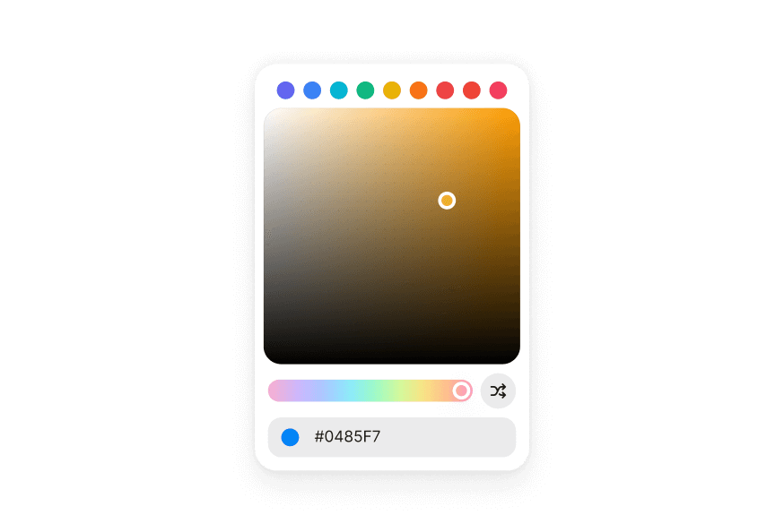
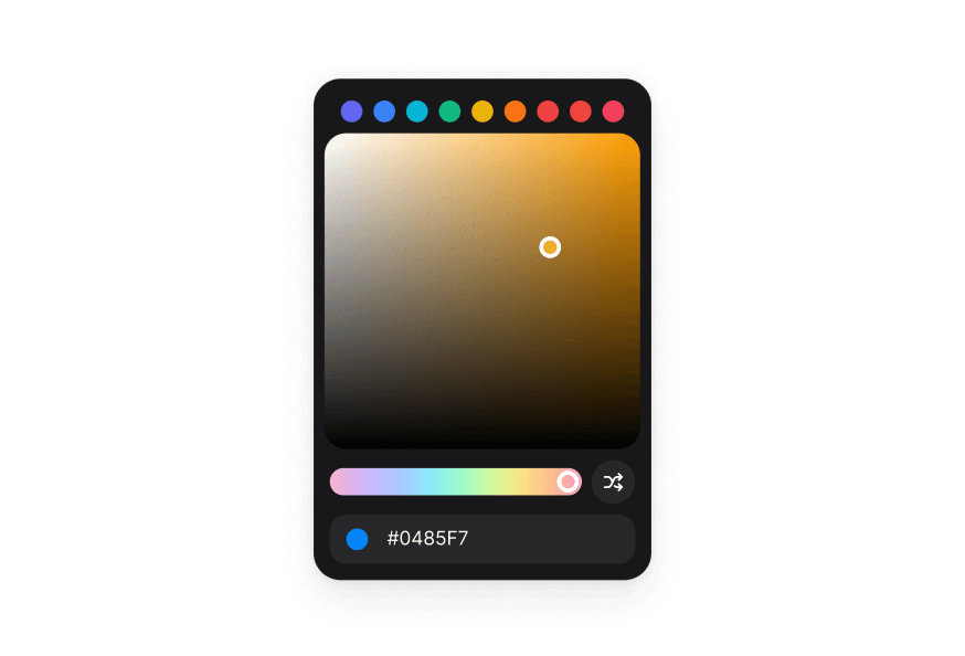
Colors




Controls
Data Display
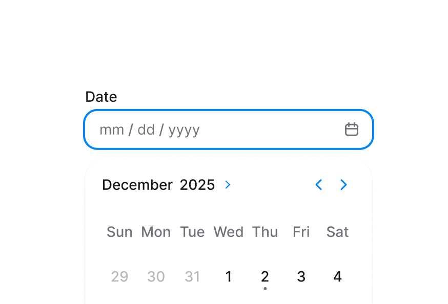
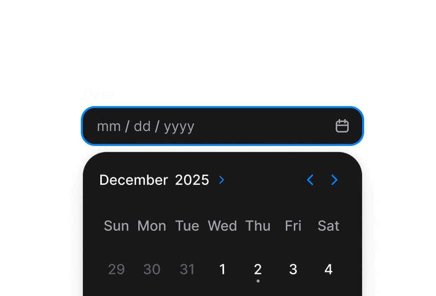
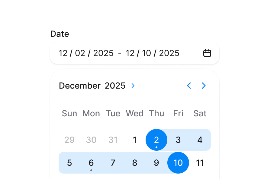
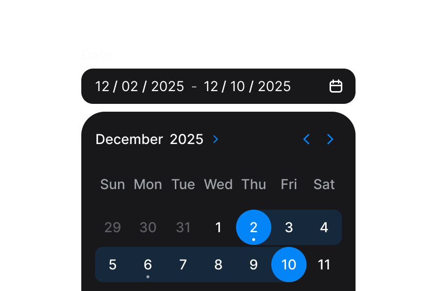
Date and Time
Feedback








Forms
Checkbox
 CheckboxGroup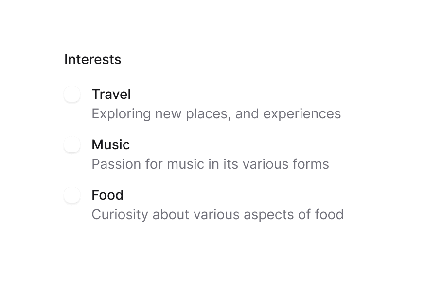
 Description
 ErrorMessage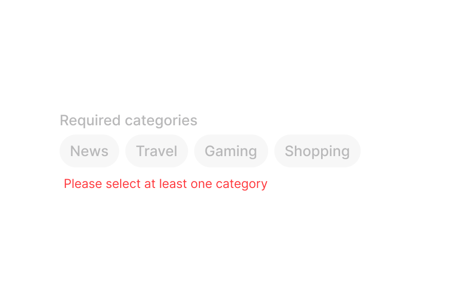
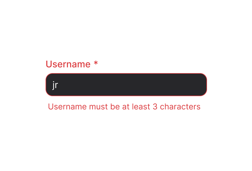
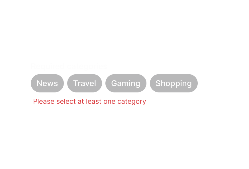 FieldError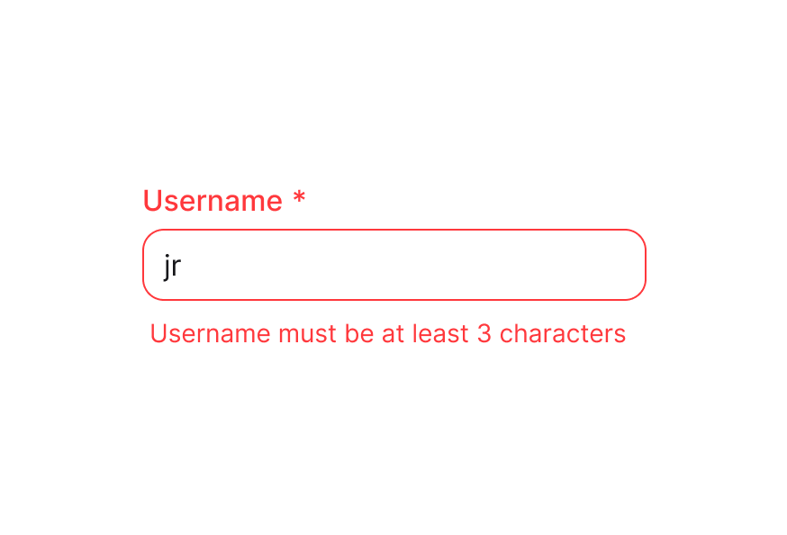
 Fieldset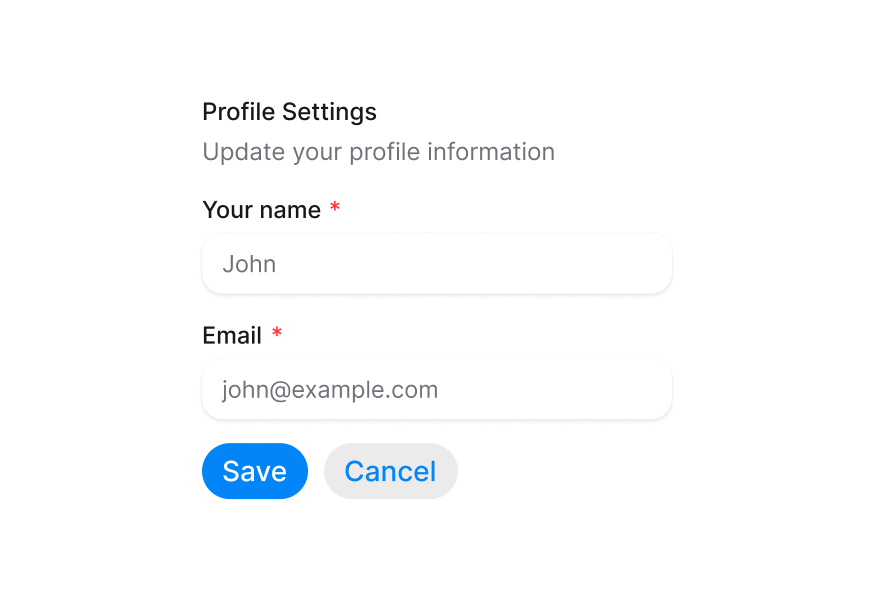
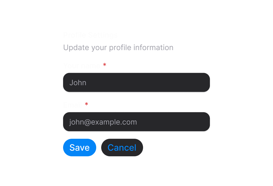 Form
Form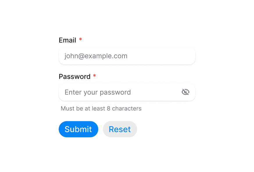
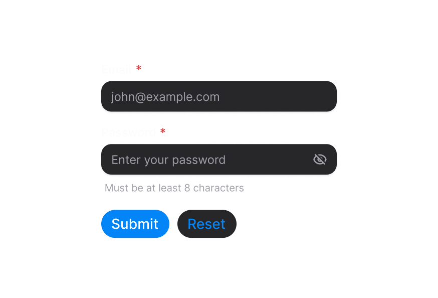 Input
Input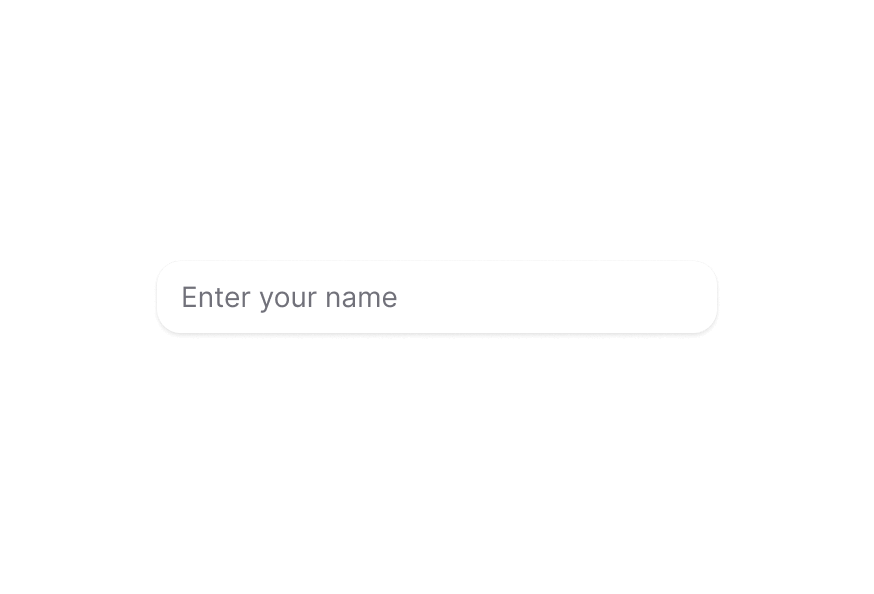
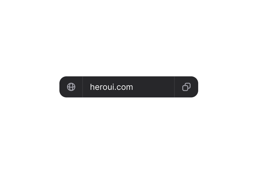
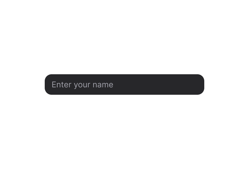 InputGroup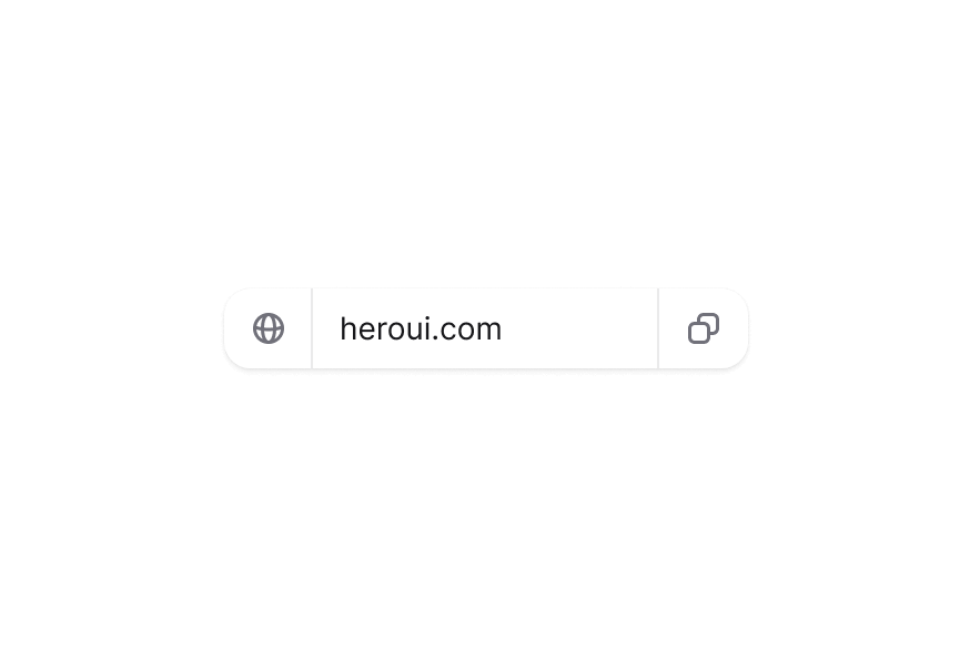
 InputOTP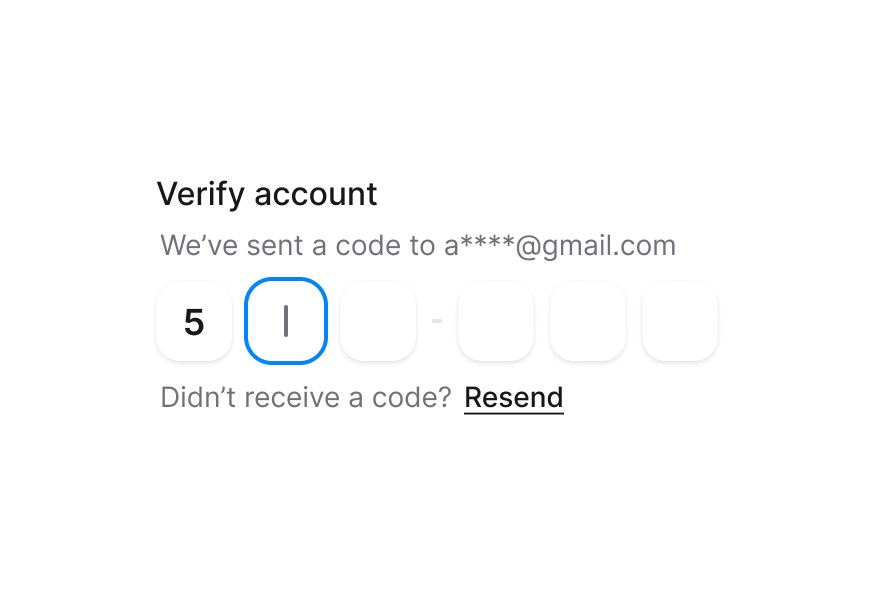
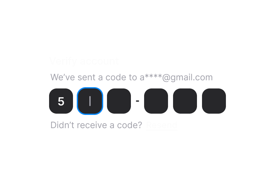 Label
Label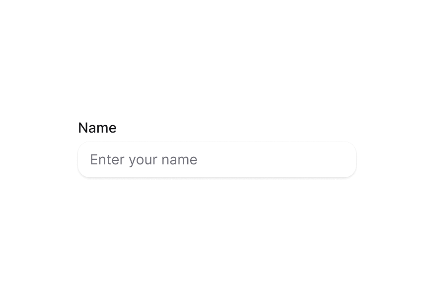
 NumberField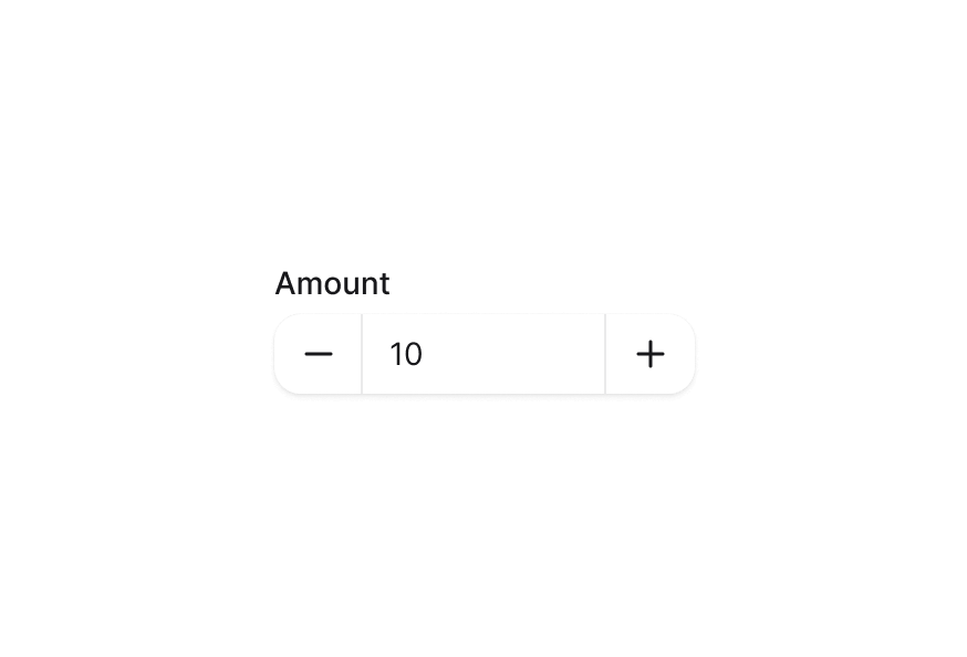
 RadioGroup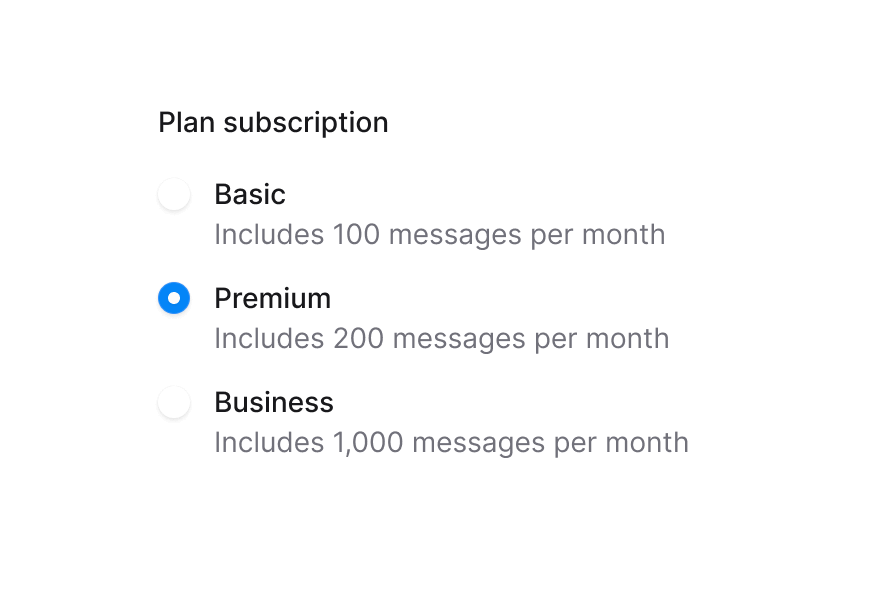
 SearchField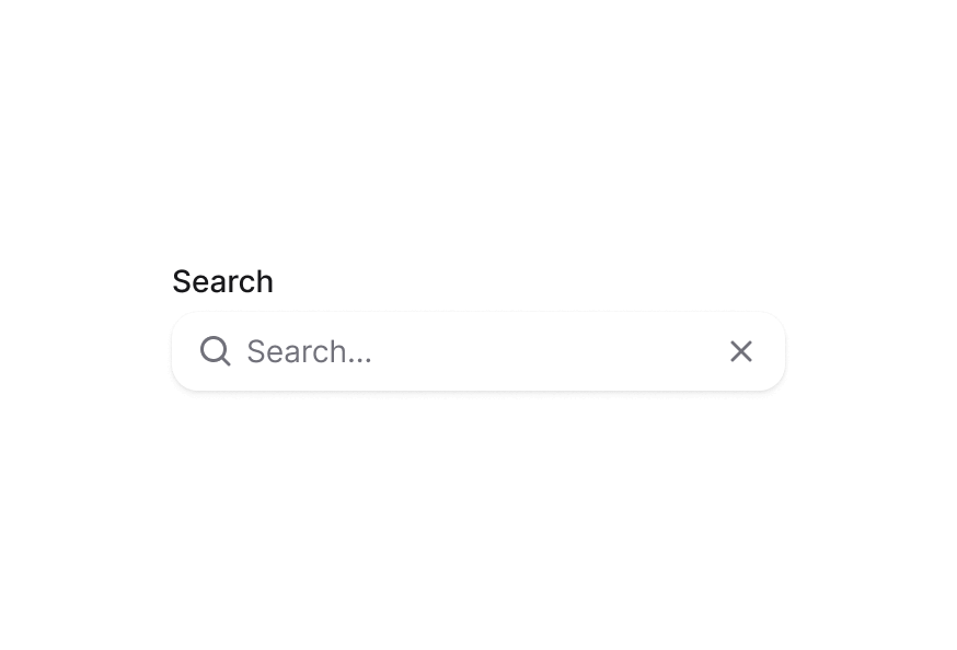
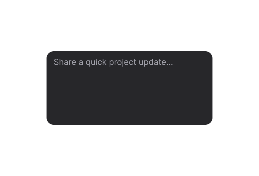
 TextArea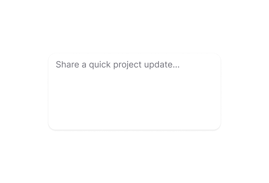
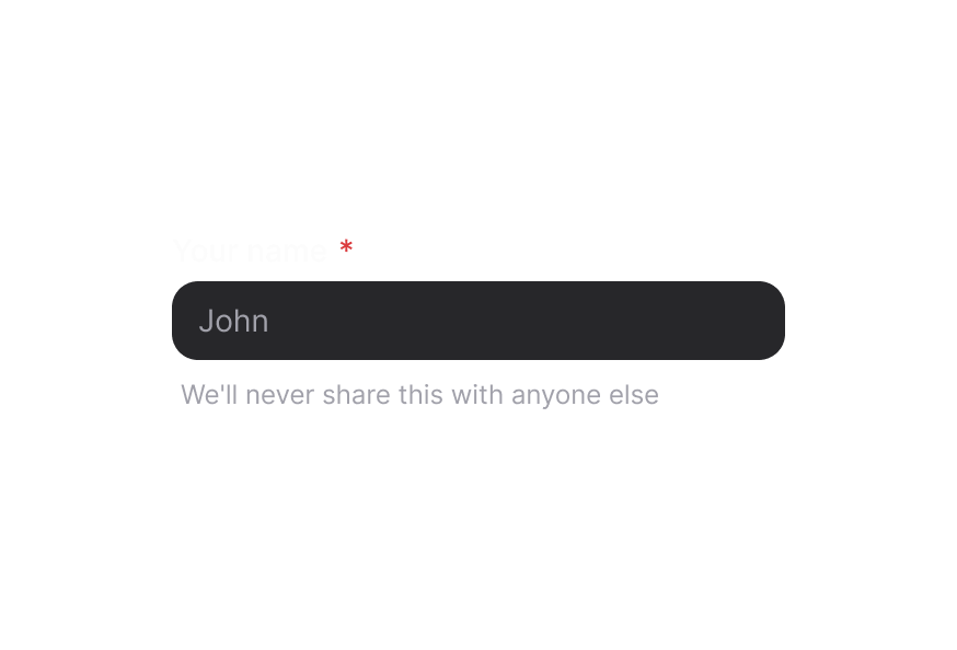
 TextField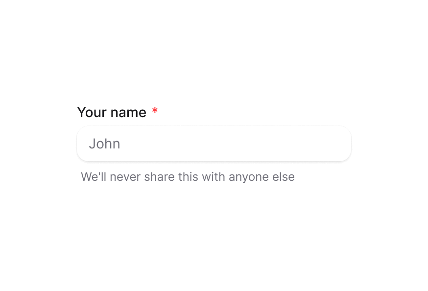
CheckboxGroupDescriptionErrorMessageFieldErrorFieldsetFormInputInputGroupInputOTPLabelNumberFieldRadioGroupSearchFieldTextAreaTextFieldLayout



Media
Navigation


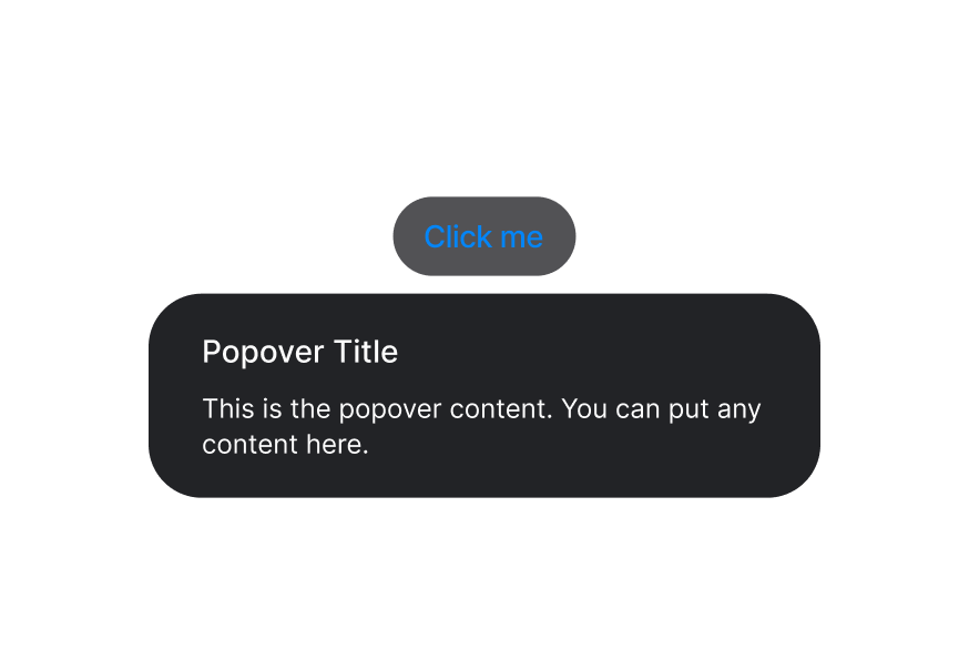
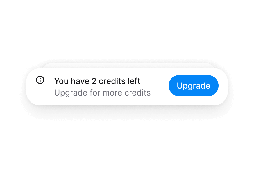
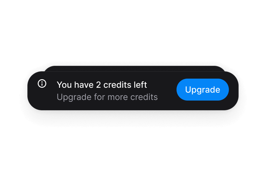
Overlays


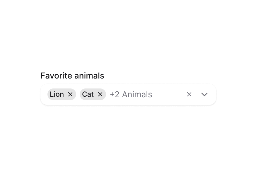
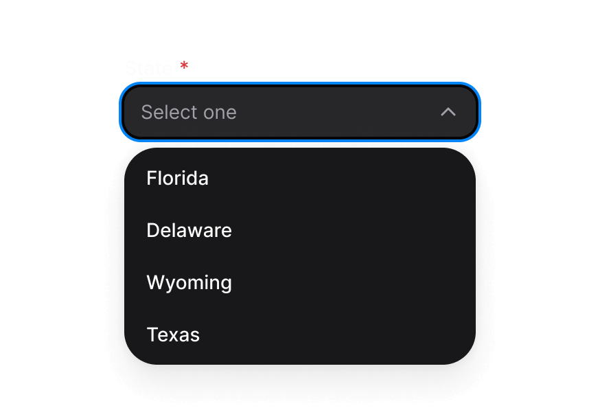
Pickers
Typography
Utilities
Additional components
CalendarYearPickerYear selection within the calendar's date and focus context.ColorInputGroupInput sections that share a color field's editing context.DateInputGroupDate input sections sharing the date field's segment context.EmptyStateA structural explanation and next action when a collection has no content.HeaderA structural heading region for a page or section.ListBoxItemAn option participating in the enclosing list box's selection model.ListBoxSectionA labelled option group within a list box collection.MenuItemA command, checkbox or radio item in the enclosing Menu context.MenuSectionA labelled command group within a Menu popup.RadioOne mutually exclusive choice within a native radio group.SwitchGroupRelated switches grouped with a shared label and description.TagAn item in a tag collection, with optional removal.